

FREYJA
Brand Identity | Campaign | Product Design
2024
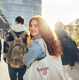
Over a three month period, I developed Freyja, a period product brand centered on care, comfort, and connection. With a mission to educate and destigmatize menstrual health, I crafted a cohesive brand identity and designed Freyja Fair, an interactive public event fostering open dialogue, awareness, and empowerment. This project seamlessly blends branding, event design, and impactful messaging to create an inclusive and engaging experience.

CAMPAIGN
To complement the Freyja brand, I created Freyja Fair—a public-facing campaign designed to spark open, stigma-free conversations about periods and menstrual health. Held in public spaces, the event invites participants to try hydro dipping, a creative process where acrylic paint is swirled into water to create a marbled pattern—mirroring Freyja’s brand visuals. The activity serves as both a hands-on craft and a symbolic gesture: embracing the fluid, ever-changing experience of menstruation.
Freyja Fair promotes empowerment through openness. Through social media and school outreach, the campaign aims to reach young girls who may lack access to support or education, helping them feel seen, heard, and prepared. It’s about making space for curiosity, conversation, and care.


PROCESS WORK
I surveyed 36 women to explore their preferences, frustrations, and hopes around period products. A major takeaway: many don’t feel accurately represented in current branding and that most period brands feel outdated or overwhelming—especially for new users. These insights shaped Freyja. I wanted the brand to feel warm and feminine while drawing strength from its Nordic namesake. The color palette and patterns—subtly inspired by female anatomy—aim to break stigma and create a space that feels both empowering and approachable.

