

BRUIN TENNIS
Rebrand | Logo Design
2024
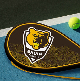
I was commissioned to design a logo and brand identity for the Capital High Tennis team in Helena, MT. I designed a logo featuring the Bruin mascot and a crest that seamlessly adapts across multiple platforms. The design embodies strength and team unity, with a balanced and symmetrical structure that reinforces its powerful presence.

GOAL & SOLUTION
Understanding the legacy that the Capital High tennis team carries, I set out to honor that tradition while introducing a fresh, modern perspective. I combined a timeless crest shape—symbolizing heritage and pride—with a clean, contemporary sans-serif font to strike a balance between legacy and a bold, refreshed identity. The school’s gold and brown colors were central to the design, grounding the mark in school spirit while complementing the strong, cohesive visual direction.


PROCESS WORK
As someone who played on this team throughout high school, I felt a strong personal connection to what this symbol represents—the strength, resilience, and unity of the players, both individually and as a team. I carefully explored different typefaces to find one that matched the tone and weight of the logo, working to create a cohesive and well-balanced visual identity. Every element was considered to reflect both the spirit of the team and the legacy it carries.

